I recently attended a wedding as a guest, and afterward I had a chance to look through some of the photographs taken by the wedding photographer. One detail kept pulling my attention away from everything else.
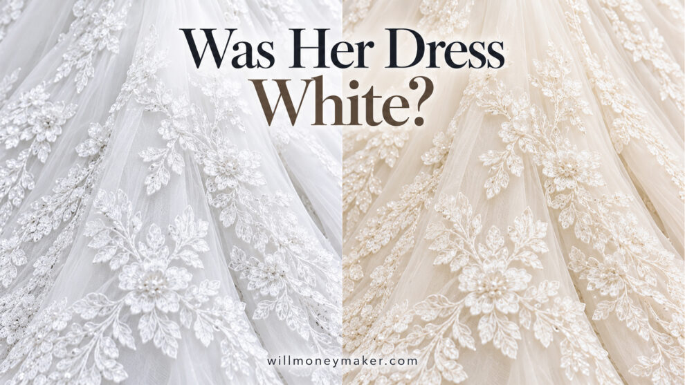
The bride’s dress didn’t look white.
It had a tan cast, almost as if a light sepia tone had been applied to the image. Maybe that was part of the photographer’s style. Some photographers like warm skin tones, softened greens, faded shadows, and a vintage look. I understand that. We all make choices that shape the way our photographs look.
But I kept coming back to the dress because I remembered it differently.
I remembered it as white.
Photography Clips Newsletter
Get my latest articles, thoughts on photography and creativity, and Photography Clips episodes in your inbox.
That got me thinking about how I would want to handle the same situation if I were photographing the wedding myself. How far should a photographer’s editing style be allowed to change something the bride chose so carefully?
For me, the answer is fairly simple. Style has its place, but the dress should still look like the dress she wore.
That doesn’t mean every wedding dress needs to be pushed toward bright white. Dresses come in all kinds of shades, including soft white, ivory, cream, and champagne. If the dress were ivory, I would want that warmth to remain. If it were white, I wouldn’t want it drifting into beige because a preset warmed the entire photograph.
The point isn’t to make the dress whiter.
The point is to keep it honest.
A wedding dress carries more weight than we sometimes give it credit for. The bride may have spent months looking for it. She may have tried on several before finding the one that finally felt right. Then came the fittings, alterations, and all the little adjustments that made it hers.
She probably imagined the moment when the groom would see her wearing it. She may have thought about walking down the aisle, the photographs, and how that dress would look years later when she opened the album again.
So when I look at wedding photographs, I think the photographer has some responsibility to preserve that choice rather than letting an editing style overpower it.
I especially think about the outdoor portraits because that’s where the photographer often has more control. When I photograph a bride and groom outdoors, I usually try to place them in steady, flattering light. Open shade is often useful because it provides softer light without the harsh shadows you get in direct midday sun. I use the same idea with the wedding party.
That kind of light helps me see what is actually there.
The skin tones are easier to judge. The groom’s clothing reads more naturally. The flowers hold their color. And the bride’s dress is easier to evaluate without a dozen competing light sources pulling the color in different directions.
If the dress were white, I would want it to read as white.
If it were ivory, I would want to preserve that.
Warmth itself isn’t the problem. Late afternoon light can give a photograph a beautiful golden quality. Grass can reflect green. Open sky can add a touch of blue to the shadows. Nearby brick, wood, or trees can influence the scene. Some of that color belongs because it was part of the light at the time.
What I’m wary of is when the processing pushes everything so far that the dress becomes something it wasn’t meant to be.
That can happen quickly.
A photographer applies a favorite preset and likes how it affects the overall image. The skin looks warmer. The greens soften. The shadows take on a certain character. The photograph suddenly matches the rest of the photographer’s work.
Then you look at the dress.
The white has turned beige.
The ivory has become tan.
The photographer may see consistency.
The bride may simply see the wrong dress.
That’s why I’ve always thought of presets as a starting point rather than an answer. Apply one if it helps you get where you want to go, but then stop and actually look at the photograph.
What happened to the skin?
What happened to the shirt?
What happened to the flowers?
What happened to the dress?
The bride chose the dress. She didn’t choose the preset.
The technical side still has to be handled carefully. Clicking the white-balance eyedropper on the dress may seem like an easy solution, but it isn’t always reliable. If the dress is ivory, cream, or champagne, that warmth belongs in the fabric. Telling the software to be neutral can remove color that should have remained.
The dress can also pick up reflections from the surroundings. Grass can add green to the lower part of the fabric. Open sky can cool the shadows. A brick wall can warm one side. Clicking one of those areas could throw off the color of the entire photograph.
And if the brightest part of the dress is already close to overexposed, there may not be enough reliable color information left there to use as a reference.
That’s where a gray card or ColorChecker can be helpful. I wouldn’t hold it against the dress and try to match the fabric. I’d place it in the same light falling on the bride.
One quick reference photograph under that lighting setup can give me a neutral starting point for the rest of the images made there. If the light changes, I make another reference. Move from shade into sunlight; photograph another one. Go to the other side of a building where the reflected color changes, and do it again.
That gives me something dependable when I sit down to edit later.
But even then, I still have to use my eyes.
A gray card can help correct the color of the light. It can’t tell me whether the dress itself was bright white, soft white, or ivory. I have to pay attention to that during the wedding.
That may be the larger point here.
Photography tools can help us get technically close, but they don’t replace the act of noticing.
I like the idea of making a simple reference photograph of the dress early in the day under reasonably neutral light. It doesn’t have to be a finished portrait. It’s simply something I can return to later when I’m editing and wondering whether I’ve pushed the color too far.
Once the overall white balance is close, I look at the bride’s skin and the dress together. Both need to look believable.
If the skin looks good but the lower part of the dress has picked up green from the grass, I’d rather correct that small area than change the whole photograph. If one side has picked up warmth from a brick wall, I can reduce that cast locally without cooling the bride’s face.
Those corrections don’t need to be aggressive.
I’m not trying to bleach the dress or force it into some theoretical perfect white. I’m trying to remove color that doesn’t belong while protecting the shade she actually chose.
The same goes for exposure.
A white dress shouldn’t become a blank white shape. Lace, folds, stitching, beadwork, and texture all need room to show. White fabric still contains highlights, middle tones, and shadows. The parts turned away from the light will naturally be darker.
The dress doesn’t have to be pure white in every pixel.
It simply needs to read correctly.
Shooting RAW helps because it gives you more room to correct white balance and recover detail later. RAW files are larger, and a full wedding can produce an enormous amount of data, so I understand why some photographers look for compromises such as compressed RAW formats like Canon’s C-RAW.
JPEG can still produce excellent wedding photographs. It just means exposure and white balance need to be closer in the camera because there’s less room to move afterward.
Indoor weddings are where all of this can become difficult.
Churches can have several kinds of light in the same room. Warm bulbs in one area, cooler LEDs somewhere else, daylight coming through windows, and perhaps another source near the altar. The bride may be standing in more than one color of light at the same time.
One side of the dress can look warm while the other side leans blue or green.
A gray card can still help establish a starting point, but there are times when one global white-balance adjustment simply can’t fix everything. That’s another reason I place so much value on the outdoor portraits. If I can photograph the bride, groom, and wedding party in steady natural light, I have a much better chance of recording the people, clothing, and colors in a believable way.
I don’t think any of this means wedding photographs should all look the same.
They shouldn’t.
Photographers should have style. We should make choices about color, contrast, mood, light, and processing. That’s part of what separates one photographer’s work from another.
But style should support the people in the photograph.
It shouldn’t overpower them.
A preset that looks fashionable today may look very different years from now. The bride’s dress, however, will always be part of that wedding. Someday she may sit with her children or grandchildren and turn through those photographs. They may look closely at the lace, the shape of the dress, and the way she looked standing beside the groom.
They should be able to see what she chose.
A white dress can still reflect the warmth of the evening. It can pick up a little color from the world around it. It doesn’t need to look cold, sterile, or artificially bright.
But when the editing is finished, it should still look like her dress.
Learn More
Understanding White Balance
https://www.moneymakerphotography.com/understanding-white-balance/
Perfecting Portraiture #2: Skin
https://www.moneymakerphotography.com/perfecting-portraiture-2-skin/
5 Ways to Fail as a Wedding Photographer
https://www.moneymakerphotography.com/fail-as-a-wedding-photographer/
Photography Clips Newsletter
Keep looking. Keep creating.
Follow along with my photographs, journal entries, Photography Clips, and occasional life updates.
Free to join. Unsubscribe anytime.