Every once in a while, I come across a story that reminds me how connected all the creative fields really are — photography, design, printing, art. They all share one foundation: color.
That’s what drew me to Pantone’s story. It’s not just a company that makes color charts. It’s the reason we can all talk about color in the same language.
Pantone began as a small printing business in New Jersey in the 1950s. Back then, the world of printing and design had a major problem: color consistency. What one printer called red might come out as pink or orange somewhere else. There was no universal system. The industry was full of guesswork and frustration.
Then came a young chemist named Lawrence Herbert. He joined Pantone in 1956 and quickly saw how chaotic color reproduction really was. With his background in chemistry and an appreciation for the precision of color, Herbert started developing a standardized way to mix and identify hues. In 1962, he bought the company and focused it entirely on color science.
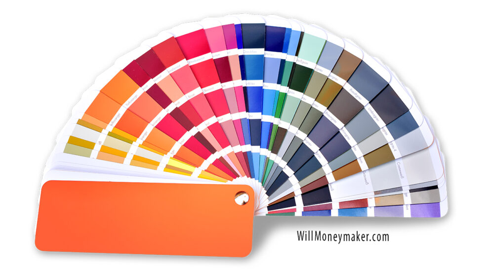
In 1963, he introduced the Pantone Matching System, known today as PMS. It was revolutionary.
Instead of vague descriptions like “light blue” or “forest green,” each color had a specific number and formula. Printers could now reproduce color precisely, no matter where they were in the world. Designers, manufacturers, and artists could all communicate with perfect clarity.
This changed the landscape of printing and design forever. For the first time, color had a common language.
As photography advanced through the 1960s and 1970s, Pantone’s system helped standardize printing across magazines, advertisements, and fine-art reproductions. It gave photographers and publishers a shared reference for how their work would appear on the printed page — a crucial step when color accuracy was everything.
By the 1980s, Pantone was no longer just a technical reference. It had become a cultural force. The company created the Pantone Color Institute, a division dedicated to studying color trends and psychology. The Institute looked at how color affects perception and emotion, and how it influences branding, marketing, and art. This was the era when corporations began to “own” colors — Coca-Cola red, Tiffany blue, Kodak yellow — hues that became part of their identity.
In the year 2000, Pantone launched something that turned its research into a global conversation: the Color of the Year.
Each year since then, Pantone’s team of color specialists has analyzed everything from art and fashion to social and political shifts to choose one color that captures the collective feeling of the moment.
Here are a few that stand out.
2000: Cerulean. A calm, peaceful blue chosen for the optimism and clarity people hoped to find in a new century.
2010: Turquoise. A cool, oceanic color that spoke of renewal and escape.
2020: Classic Blue. A steady, reassuring tone in a time of uncertainty.
2025: Mocha Mousse. A warm, earthy brown symbolizing comfort, grounding, and a return to natural simplicity.
These choices aren’t random. They reflect cultural moods, creative directions, and even the technologies shaping visual life.
Pantone’s influence only deepened as the world went digital. Their system expanded into software, mobile apps, and digital libraries through Pantone Connect, which lets designers and photographers access thousands of colors anywhere. It’s a bridge between print and screen — the old world of ink and the new world of pixels.
Pantone also entered conversations about sustainability, exploring environmentally safer pigments and processes. That may not sound glamorous, but it’s part of the same philosophy Herbert started with — making color not only consistent, but responsible.
What draws me to all this is that Pantone sits at the crossroads of art and science, just like photography does.
Even though most of my finished work ends up in black and white, I always shoot in color. I want to capture every tone and subtle shift in light. When I convert a photo later, those color values determine how the final black-and-white image will feel. So in a way, every monochrome print still begins as a color photograph — just interpreted differently.
That’s why Pantone fascinates me. They didn’t just create a chart; they gave us a system that helps explain what we see, and how we feel when we see it. They made color measurable without taking away its mystery.
Pantone’s influence runs through almost every part of visual culture — photography, film, fashion, architecture, and digital media. And yet, it started with one chemist mixing inks in a small workshop, trying to make sense of color’s chaos.
It’s remarkable to think that from those first color swatches came a universal language that continues to shape how we perceive the world today.