How do you choose printing papers and methods? If you’re like many photographers, you go by popular opinion on one aspect or another. Perhaps you choose papers based on their archival qualities because one paper or another won’t be yellow with time. Maybe you like certain finishes because they better protect the photograph. Sometimes we make the choice because various experts have told us that this or that paper, or this or that technique renders black and white better or shows off color more. People have even done extensive testing to find out which papers and printing methods produce the blackest of blacks.
That’s how a lot of us make the choice—but as with all things in photography, there is a certain amount of following your heart that needs to be done. Whatever the accepted methods are for whatever you’re trying to accomplish with your prints, at the end of the day, it’s best to do what you feel best suits the photograph.
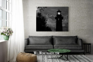
For some of us, that might mean using methods that produce matte prints for black-and-white photography because something about a high gloss finish on a black-and-white image just makes the image feel off. Grim and gritty images, too, often “feel” better when they’re as matte as possible rather than polished and glossy. Perhaps because they give the image an even grittier, almost graphical quality like something you’d see splashed across movie posters for a film noir.
But what about when images are warm and colorful? Here, maybe gloss is the answer, or maybe metal printing methods or metallic papers to make the colors really pop.
And the ideas I posited above? That’s all they are—ideas. It’ll be different for everyone. The key, I think, is to print using papers and methods that feel right to you and feel right for the photograph that you’re printing.
This is where test prints can be a lot of fun if you’ve got the resources to do it. Make some small versions of images that you want to print—3×2, 4×6, 5×7—this doesn’t matter so much as long as it’s close enough to the final aspect ratio that you can see most of the frame in the test prints. It should be large enough so that it strikes a balance between being “big enough to see important details” but not so big that test prints using various methods and papers are prohibitively expensive.
Then, just try a variety of papers and techniques that interest you, and try a variety of finishes, too. Lay them out somewhere that you can spend a week experiencing them. And as you experience them? Go ahead and toss out popular opinions. Throw away “what the experts say” about this or that printing technique. Ignore everything except for what you feel about the prints. Do you find yourself gravitating to one over the others? When you walk past, are there certain versions that catch your eye while others go ignored? A print that just doesn’t feel as nice as the others? Keep these observations in mind, and at the end of the week, choose what feels best to you—and then you’ll know what the best printing techniques are.
Now, go and enjoy the beauty of God’s creation through your lens.


