Techniques for Creating Artistic Photographs
Composition is what transforms a simple snapshot into a work of art. It’s what makes an image of an ordinary subject extraordinary. The concepts used in fine art photography are the same concepts that have been practiced by great artists for centuries. Whether your medium is paint on canvas or light on film, the following guidelines will help you create something more than a simple visual record.
The Rule of Thirds
I’ve found that one of the best guidelines for creating interesting images is something that was invented long before cameras: the Rule of Thirds. Painters first used the Rule of Thirds during the Renaissance era as a way to add interest to their work. Since the dawn of photography as an art form, photographers around the world have adopted this rule as one of their own.
It’s an easy rule to follow: Simply imagine that your viewfinder has two horizontal and two vertical lines that divide your image into equal horizontal and vertical thirds. As you’re composing the image, instead of putting your subject or other important elements in the center of the frame, line them up on one of the imaginary dividing lines.
For example, if I were to take a portrait of someone looking over their shoulder, I would place that person on one of the vertical third lines so that they are looking towards the empty side of the frame.
In a landscape photo, you can place the horizon line on the upper third line to make the earth seem expansive, or put it on the lower third line to give the impression of endless skies. Arrange elements like trees or fences so that they are also on third lines, and the resulting image will have a pleasing sense of geometrical unity.
So why does the Rule of Thirds work to create interesting images? Science says that it’s all in the way our eyes look at a photo. We don’t take the entire image in at once. Instead, we tend to look at each element of the image, starting with the subject. When you place a subject in the center, the experience is over almost before it begins – our eyes have nowhere else to look, so we stop looking. However, when you place elements on the third lines, most viewers tend to look deeper into the image. The extra time spent following the geometry gives the viewer more time to find interesting elements, which creates a deeper emotional impact.
The Power of Geometry
“You may call this a crowd of immigrants,” Alfred Stieglitz once said, “To me it is a study in mathematical lines, in balance, in a pattern of light and shade. I saw a picture of shapes.”
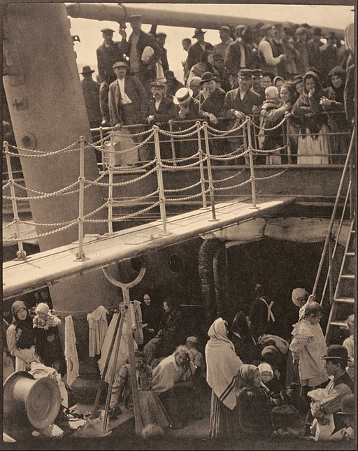
Stieglitz was the forefather of photography as an art form, and he said this in reference to his famous photo, “The Steerage.” As you examine his images, you will start to understand the importance of geometry. “The Steerage” uses the angles of the stairwell and the gangplank lead you into the image. The line of the upper deck creates a clear dividing line between two very different groups of people. Even the geometry of the people’s clothing tells a tale: The draped shawls of the people down below in the steerage section contrast the dapper hats and tailored clothes of the more well-to-do people on the upper deck.
The geometry of your photography doesn’t need to be as complex or as subtle as the geometry that Stieglitz used, but it is an important aspect of composition nonetheless. As you’re taking photos, be aware of the shapes and patterns around you, and use them to enrich your photos. You can find geometry everywhere, from the curve of blades of grass, bending in the breeze to the similar shapes found in a shot of a crowd of people.
A Range of Colors
Tonal range is another important aspect that sets amazing images apart from bland ones. When your images have a diverse tonal range, they include colors across a wide spectrum. In black and white photography, this means that instead of creating a work in shades of medium gray, you’ll need to make sure that there are interesting points of bright white and stark black to add contrast and interest. Stieglitz’s image of artist Georgia O’Keeffe is a beautiful example of a wide tonal range. Her dark hair stands out against the bright white of her robe.
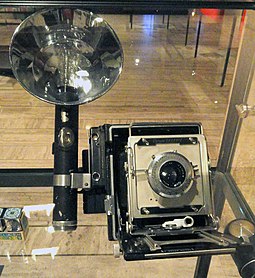
To create his photographs, Stieglitz used an Auto Graphlex camera, which was a large, boxy affair made by the Eastman Kodak Company. However, more important to his creative process – especially when it came to creating images with a wide tonal range – were the photo papers and developing processes he used. Stieglitz was famous for experimenting with the tonal range of platinum and palladium prints, and he was largely responsible for bringing color photography to the United States with the French Autochrome Lumiere process.
In color photography, the tonal range means both the difference between light and shadow and the difference between the colors in your image. You can still use blacks and whites to great effect in a color image, but you can also use contrasting colors like orange against blue to create a striking image.
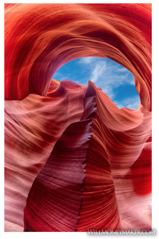
What I’ve listed here is only a small selection of the guidelines that photographers use to create art. As you learn and grow, remember that these guidelines have one key purpose: to intrigue the viewer and lead them into a deep exploration of your image. You’ll discover that there are countless ways to create that level of interest, from leading lines to layering your scenery. If you’d like to learn more about how you can use your camera to create art, watch for my next photography fundamentals post, in which we will discuss various shutter speed techniques.


